# Statistics
ChatKeeper (opens new window) is a bot with a deployed analytics system of your chat. It works with chat analysis at all levels and distances 😉 It is an ideal tool for data collection and analysis, which is used by admins and community managers of large chats.
You can view ready-made graphs based on user activity, growth, engagement, message type, and even reactions to messages.
The bot analyzes users, administrators, as well as its own work. For example, you can see which filters and triggers are triggered in your chat most often.
There are weekly charts for quick analysis, and annual statistics or setting your own time period are suitable for analyzing chat over long distances.
Tables can be downloaded in CSV format to generate reports.
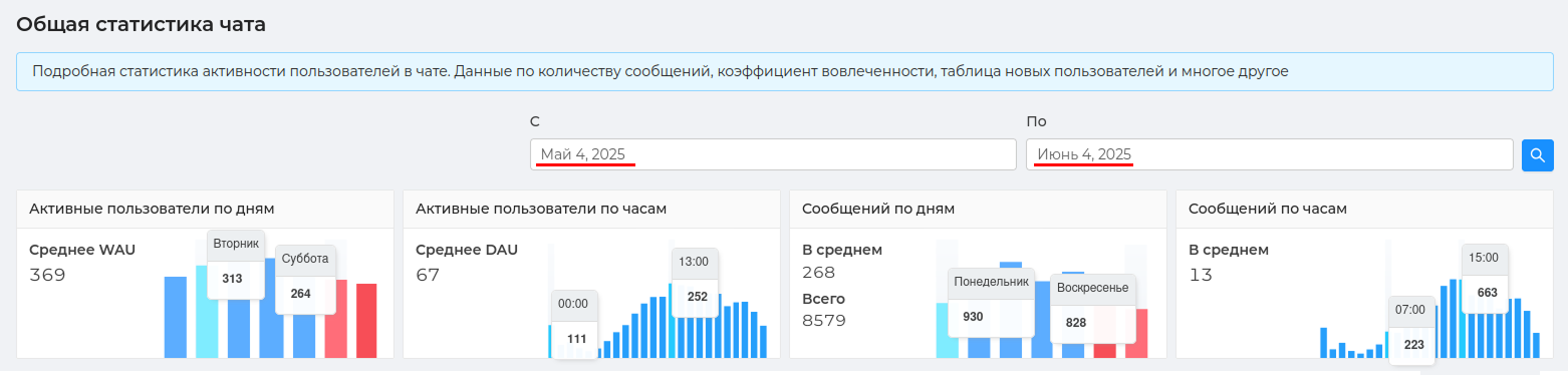
# General chat statistics
In ChatKeeper (opens new window) there are 11 schedules statistics (opens new window) for a detailed analysis of the dynamics of growth and development of your chat.
You will have access to basic metrics, metrics for in-depth chat analysis, as well as unique heat maps that visually show the highest activity in color.
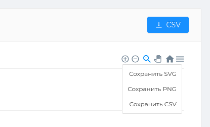
All tables can be saved in PNG, CSS, SVG formats, and also the data can be uploaded to CSV for detailed analysis.
For convenient operation, each table has a number of tools.:
— увеличить график.
— уменьшить график.
— you can select any part of the table and enlarge it.
— You can scroll the table from right to left. To do this, slowly move the mouse from one edge of the table to the other.
— reset the scale of the table to its original state.
— the ability to save the table in PNG, CSV, SVG formats.
# Basic metrics
This section contains the main and most popular metrics for analyzing your chat.
The metric WAU (Weekly Active Users) is weekly active users. Metrica tracks the number of unique visitors who have interacted with the chat over the past seven days. This indicator will help you understand the level of activity by day during the week and which days are the most in demand for communication.
The metric DAU (Daily Active Users) is daily active users. Yandex.Metrica tracks the number of unique visitors who interacted with the chat during one particular day. Here you can track the hottest times when users communicated the most.
Two adjacent graphs will show how many messages by day/hour these active users write.
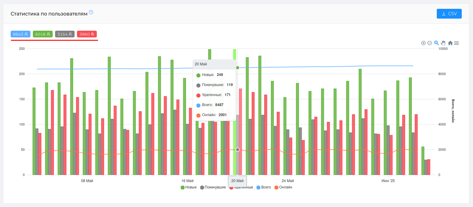
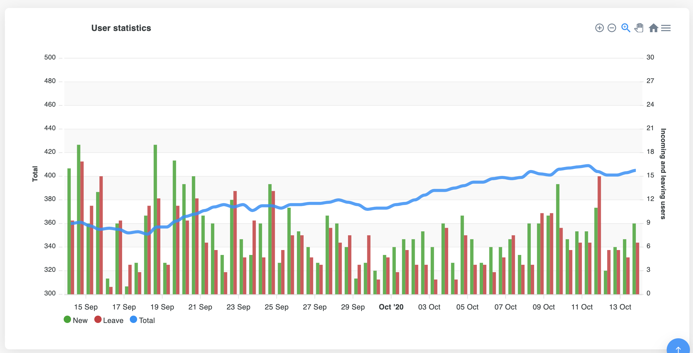
# User statistics
The main table that will quickly show ** the growth dynamics of your chat and user traffic**. Using the table, it is convenient to see the number of participants who joined on a certain day, as well as those who left the chat on their own. The number of "Deleted" participants will show how many participants violate the rules and fall under moderation.
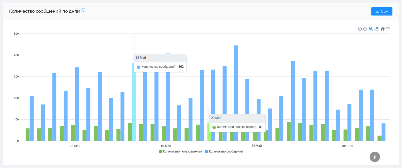
# Number of messages by day
The table will show the number of users and their messages by day. Using this graph, you can determine the average number of messages per user.
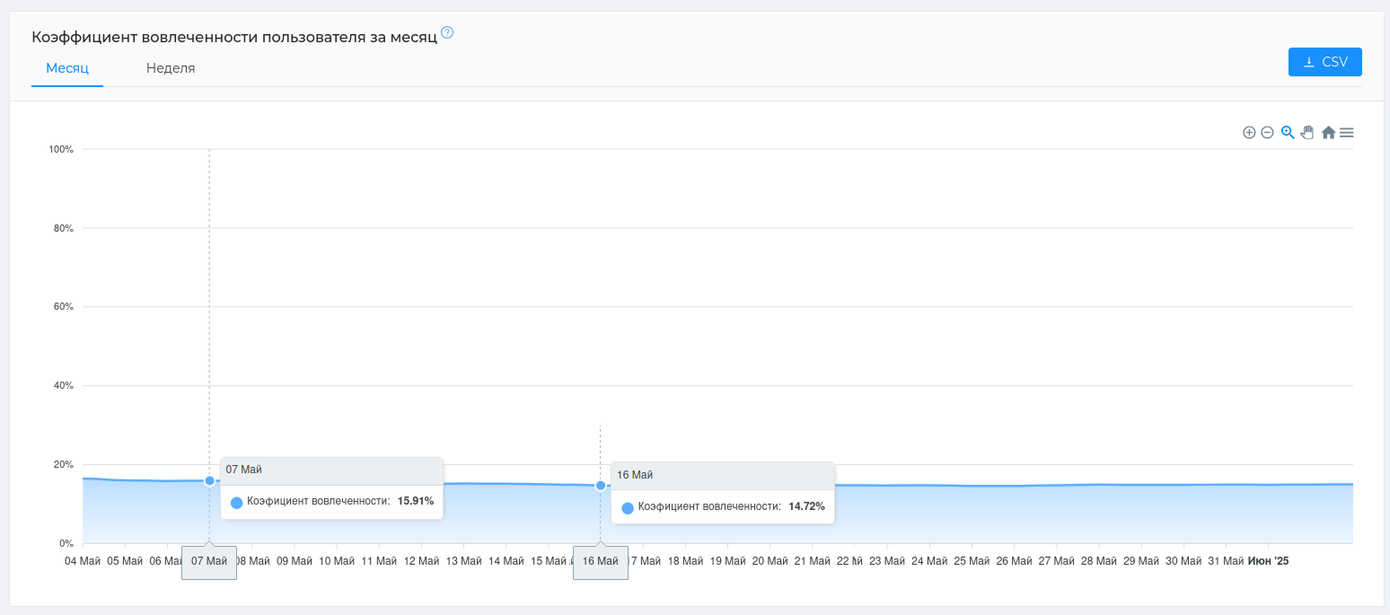
# Monthly/weekly user engagement rate
The table will show what percentage of the involved users ** writes in the chat, out of the total number of chat users.
Example: On May 7, 15.91% of the chat users were chatting. For large chats, this is considered a good indicator.
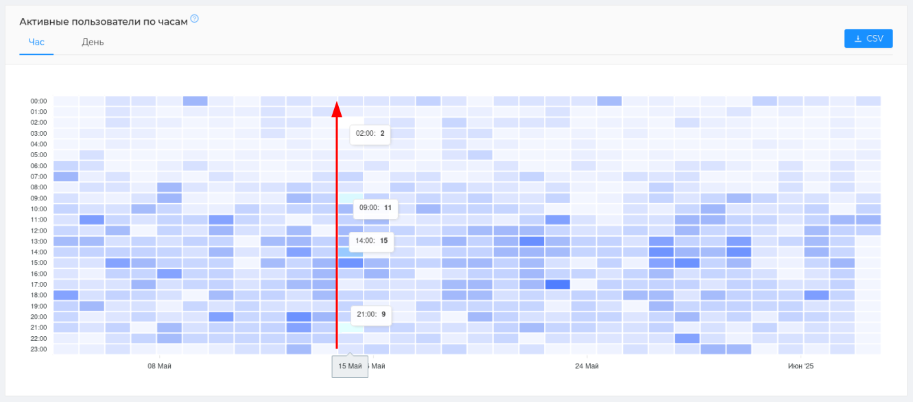
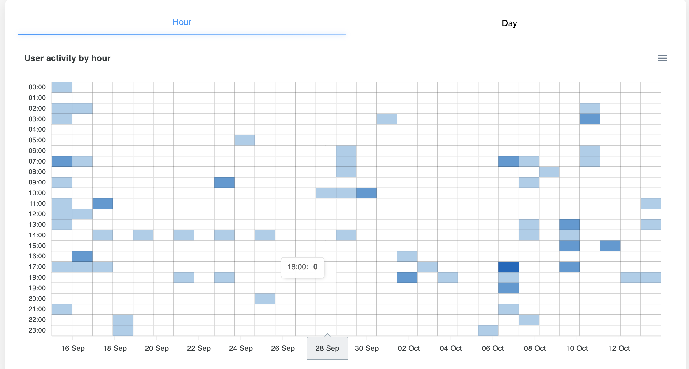
# Active users by hour/day
The table is divided into cells that indicate certain hours/days. The number in each cell is the number of active users who chatted at that hour/day. An active user is one who has written at least one message. The color of the cell depends on the number of active users in it. Dark — there are many active participants. Light is not enough.
Example: On May 15, we see that the most users communicated at 3 p.m. - 15 people, and the least at 2.00 p.m. - only 2 people.
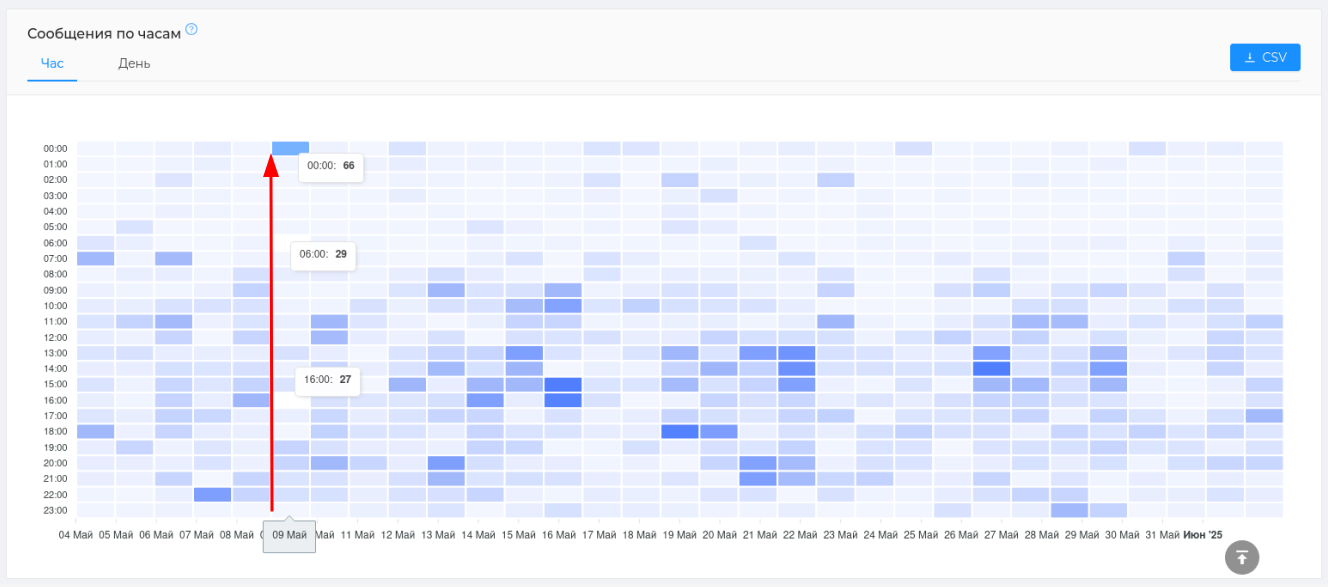
# Messages by hour/day
The table is divided into cells that indicate certain hours/days. The number in each cell is the number of messages written at a certain hour/day. The color of the cell depends on the number of messages written. Dark — lots of messages. Light is not enough.
Example: On May 9, we see that the most messages were written at night at 00.00 — 66 messages, and the least at 16.00 — 27 messages.
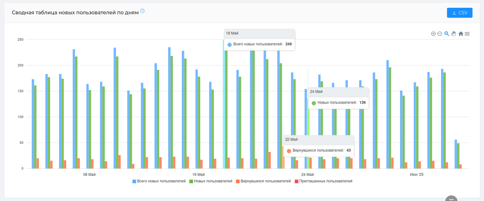
# Summary table of new users by day
The table will show the types of new users who join your chat, their number and ratio. Using the table, you will be able to determine the number of those who returned to your chat, as well as those who came via a referral link.
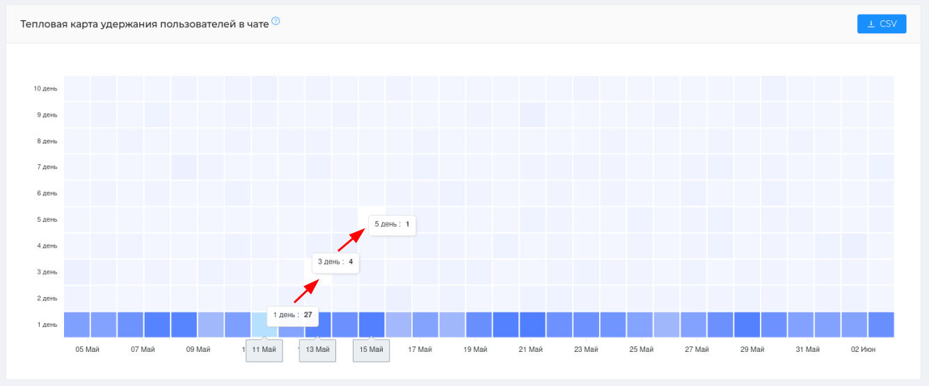
# Heat map of user retention in the chat
A unique map that shows how many users re-write to the chat every day. This card is read diagonally, from left to right.
Example: On May 11, 27 users (1 day) wrote to the chat for the first time (the first message in the chat is taken into account), on May 13, on the 3rd day after the first message, 4 of these users wrote again, on May 15, on the 5th day, only 1 of these users wrote again. That is, out of 27 users who wrote their first message on May 11, only 1 user wrote for 5 consecutive days from that date.
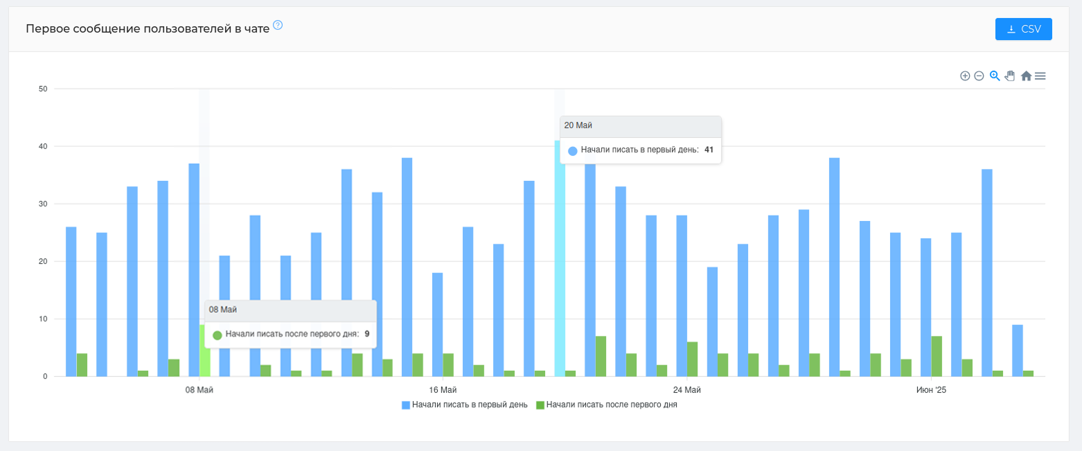
# The first message from users in the chat
The table will show the users who joined the chat and wrote the first message on the same day, as well as those who wrote only the next day. The table will help you understand users' willingness to quickly engage in communication, as well as find the reasons why participants are reluctant to engage in dialogue.
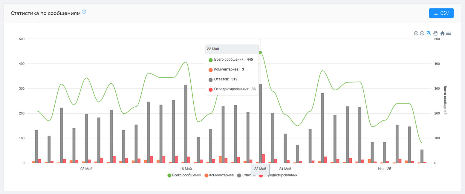
# Statistics on messages
The table will show message activity in your chat. For analysis, data is displayed on all messages (unanswered messages, replays, comments), comments (if this is a discussion chat attached to the channel), replies, and edited messages.
Using the table, you can understand how many messages in the chat are ignored (the difference between "total messages" and "replies")
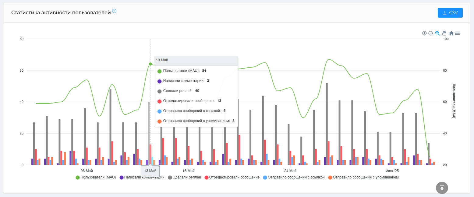
# User activity statistics
The table will show user interaction with the chat, namely the types of their messages: how many of them relate to comments and replays, the number of edited messages in the chat, or how many messages were sent with a link or mention.
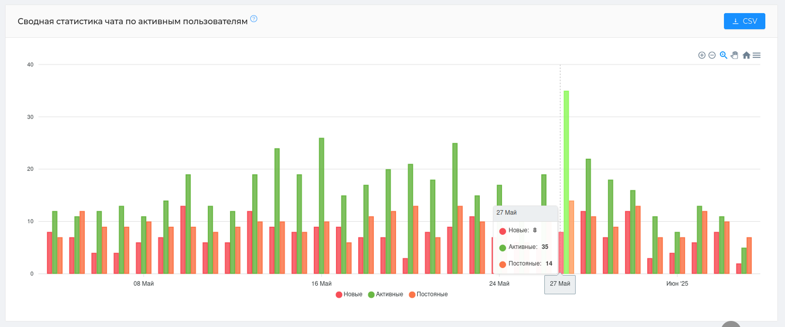
# Summary chat statistics for active users
This is a unique graph that will show the evolution of active users of your chat. Namely, how new users become active, become permanent, and how many of them remain. The graph is read from left to right.
We have divided all active users into 3 categories, which are based on the number of days they are present in the chat, the days they write and the number of their messages.
New are users who have been in the chat for less than 14 days and have written at least one message.; Regular are users who have been writing to the chat for more than 30 days, but it is not necessary that these days be consecutive. Active are participants who do not fall into any of the listed categories. Example: they've been chatting for less than 14 days, but they've already written 10 messages.
# Statistics for the year
Statistics for the year (opens new window) will show ** the dynamics of growth or decline of users and their messages**. You can use the graph to monitor the situation in your chat on a monthly basis. For example, you can determine the month with the largest audience growth or the month with the smallest number of messages written in a chat.
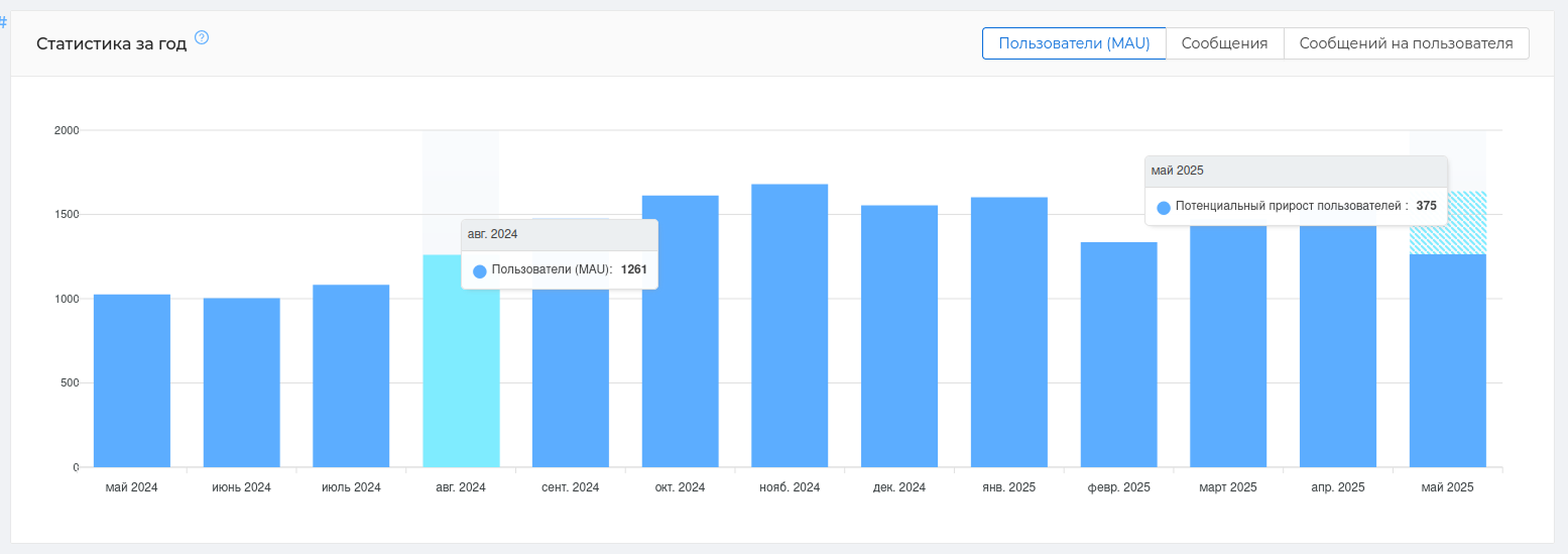
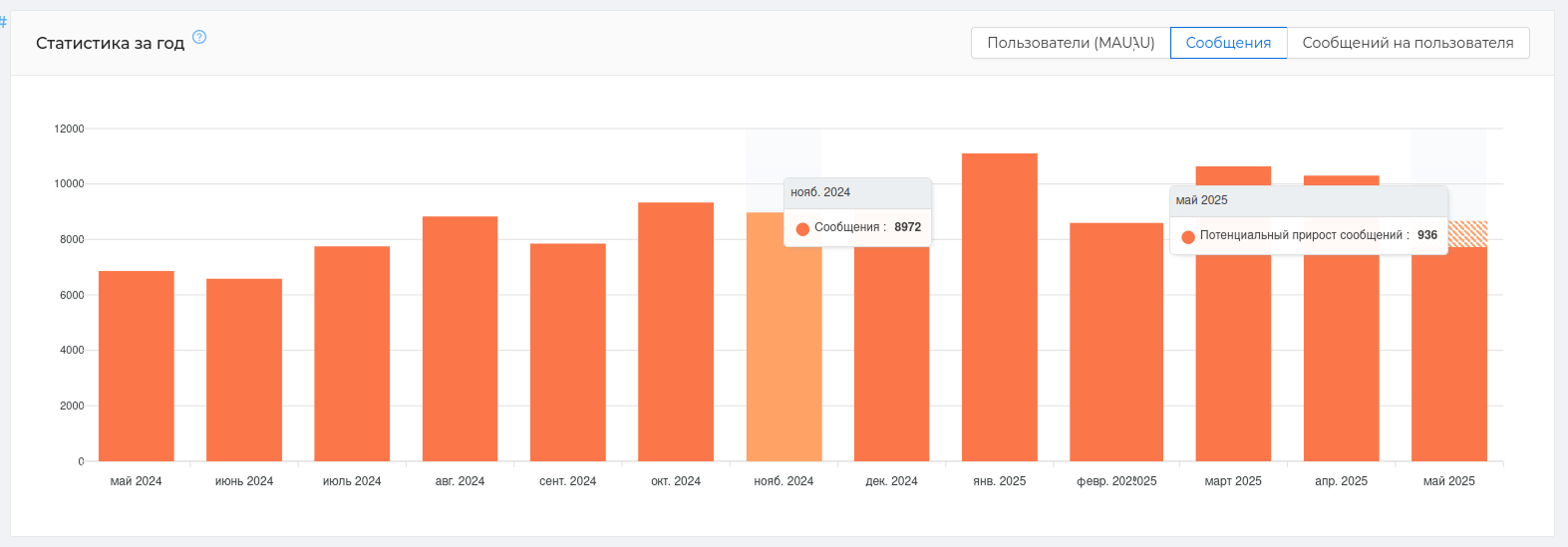
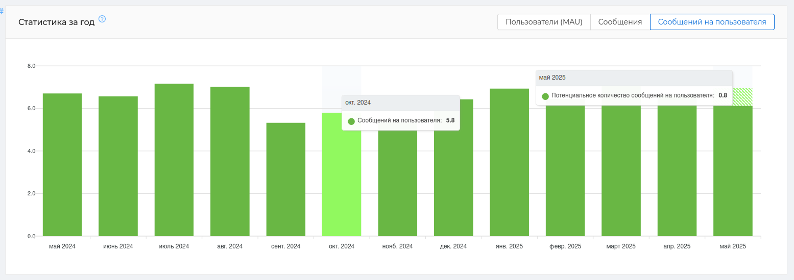
For each of the categories (opens new window) presents a development forecast for the current month (graph with hatching). It is generated automatically based on the data received for all previous months.
# Engagement map
Participant Engagement Card (opens new window) or the "community map" has no analogues and shows all active participants of your chat. The active ones are those who write in the chat.
The map will show ** who has reduced their activity or stopped writing**, and ** which users are the most important** for the community. You can ** see the loss of an active participant** in time, or notice and ** encourage the initiative of a newcomer**.
What is the use of the card: — it will help you work with an active audience as a whole and with each user separately — visual identification of the audience using colors and segmentation — it is easy to observe the dynamics of communication in more often — quickly identify leaders, prospects, and those who have lost interest.
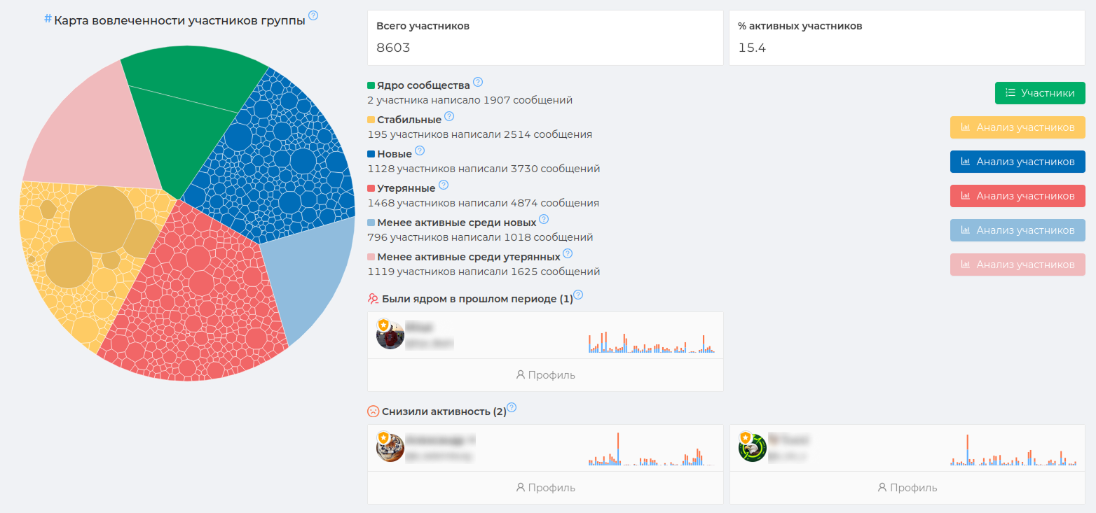
Community Map (opens new window) divide the active audience by engagement level using color. Therefore, each color in the map has its own unique meaning. In total, the map can contain ** from 1 to 7 segments of different colors**. The number of colors directly depends on the audience's activity and its volume. The larger the segment of the same color, the more participants there are with a certain activity.
The primary colors are always green, red, blue and yellow. They will be present in the map of almost any chat where there is average activity.
There are also additional colors, these are pink, blue and lemon. These colors show the least active audience among the reds, blues, and yellows, if there is a large number of them.
The meaning of colors in the map:
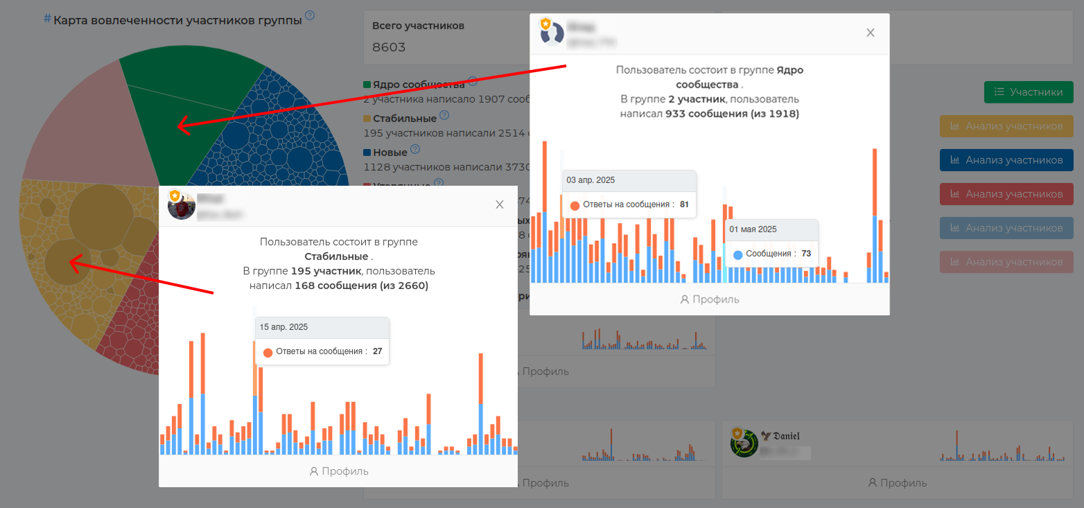
🟢 Green — the core of the community. The key contributors who contribute the most to your community. Valuable and unique users. The entire chat is based on them.
🟡 Yellow — stable users who were active during the past and current period. They write steadily and interact with the chat. Very often, among such users there are admins and those who are candidates for entry into the core — they are also marked dark.
🔵 Blue — new users who were inactive in the previous period and started to be active in the current one. These can be users who have studied the situation after joining the chat and only then wrote the first message. It is important to motivate such users to communicate, because they can move to the yellow segment.
🔴 Red — lost users who stopped being active in the current period, but were active in the previous one. It is important for such users to ** collect feedback** and find out the reason for the decrease in activity. A change in the atmosphere in the chat and conflict situations could affect the decrease in communication between previously active participants.
Lemon is the least active among the stable, which was active during the past and current period.
Blue is the least active among the new ones, which did not show activity in the previous period and began to show it in the current one.
Pink is the least active among the lost ones, which stopped showing activity in the current period of 30 days, but showed it in the previous one.
Please note that all data is output for a period of 30 days from the current date. That is, it is 30 days that have already passed. They are always displayed in comparison with the previous 30 days.
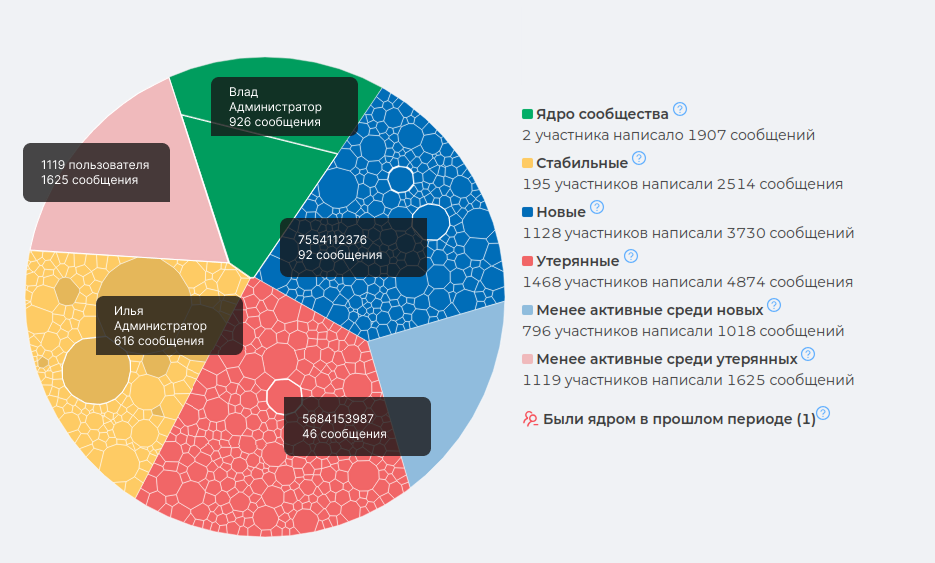
Each color segment can contain many cells of different sizes.
Cell is an individual user and the number of his messages. The color reflects its importance to the community, and the size indicates its activity. The larger the cell, the more messages the user has written.
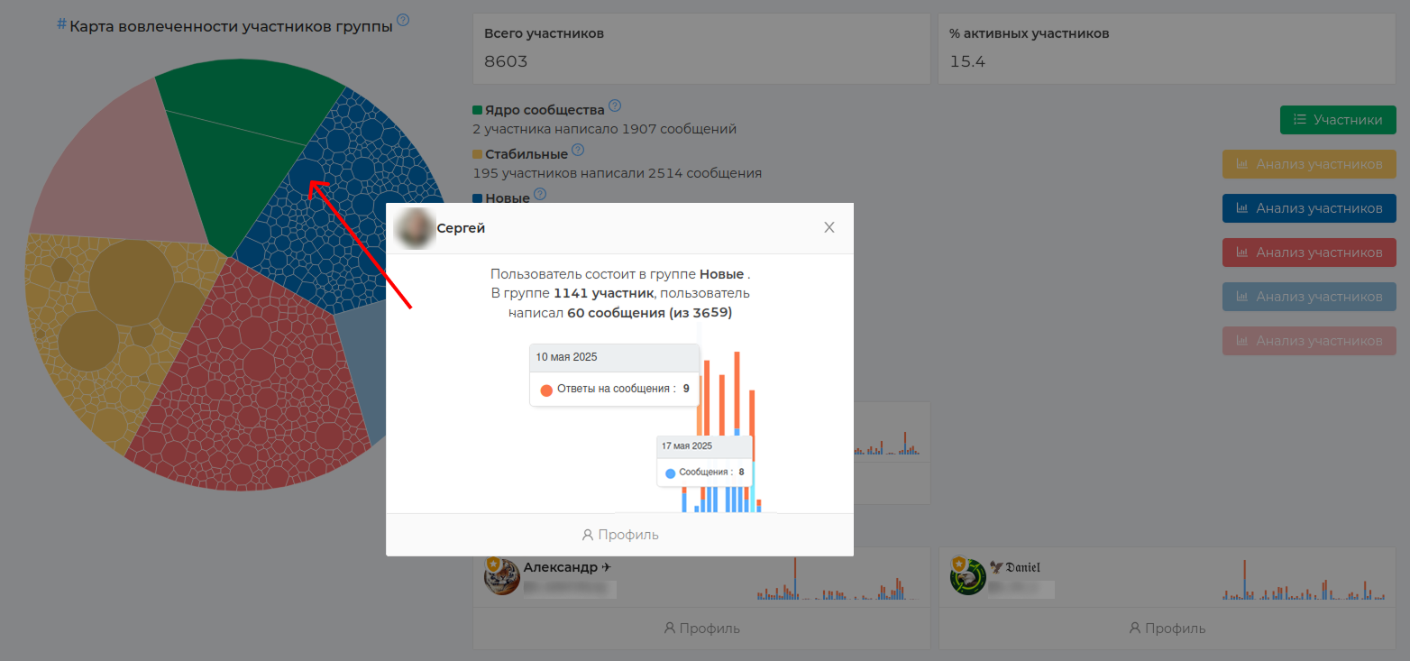
To view the user in any color segment, you need to click on the cell. The user's profile will contain information about their messages. The Profile button will show detailed information about this user's activity. Read more about this in chapter "User Analysis"
Consider an example: The screenshot shows the user from the "New" blue segment. We can see that earlier, he was not active and started writing messages quite recently. This is a promising chat participant, you need not to lose him.
The dark cell are administrators (also candidates for entry into the core). They can be in any color segment. Each administrator has a special shield icon with an asterisk attached to his profile photo, which distinguishes him from the usual user of the group.
# User analysis
In the statistics section "User Analysis (opens new window)" all data on the activity of your audience is collected: messages, responses, reactions, warnings and much more. Here you can get data on the activity of the participants in your chat as a whole and on a specific user, as well as on those who are in the group or have already left it.
What is the benefit of the section: — more metrics for different categories — you can visually compare users with each other — detailed information for each user separately — upload to CSV for generating reports
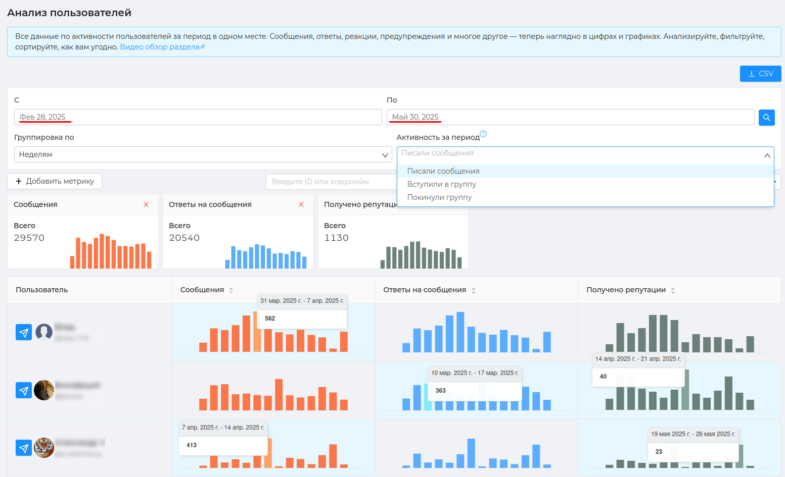
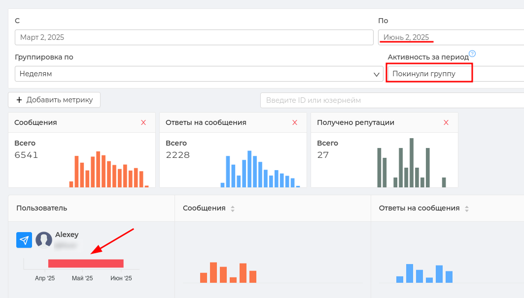
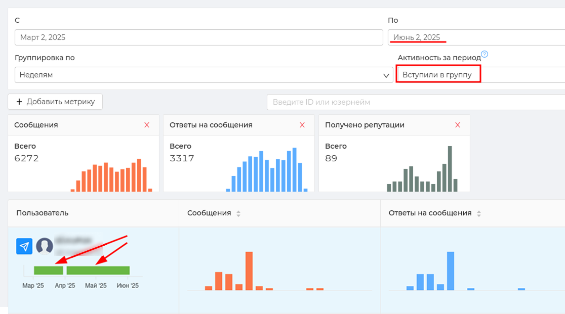
To analyze users by different metrics, you can use 3 types of audience:
Wrote messages — these are the participants who wrote at least one message in the group during the specified period. Joined a group — during the specified period, the participants joined the group and stayed in it. Left the group — these are the participants who left the group during the specified period and never returned to it. Analyzing this audience will help you find out the reason for their departure and, if necessary, take the necessary measures.
When choosing an audience Joined the group and Left the group in the card of each user, the color will indicate the period of his presence or absence in the chat.
Example: a user left the group on April 3 and never returned to it.
Example: a user joined a group on March 1 and stayed in it until March 30, then left it, returned on April 2 and are currently in it.
Statistics on user analysis (opens new window) is displayed for a certain period. By default, ** data is displayed for a period of 3 months**, but you can select the period you need. The data can also be grouped by days, weeks, months, and years. By default, grouping by week is selected.
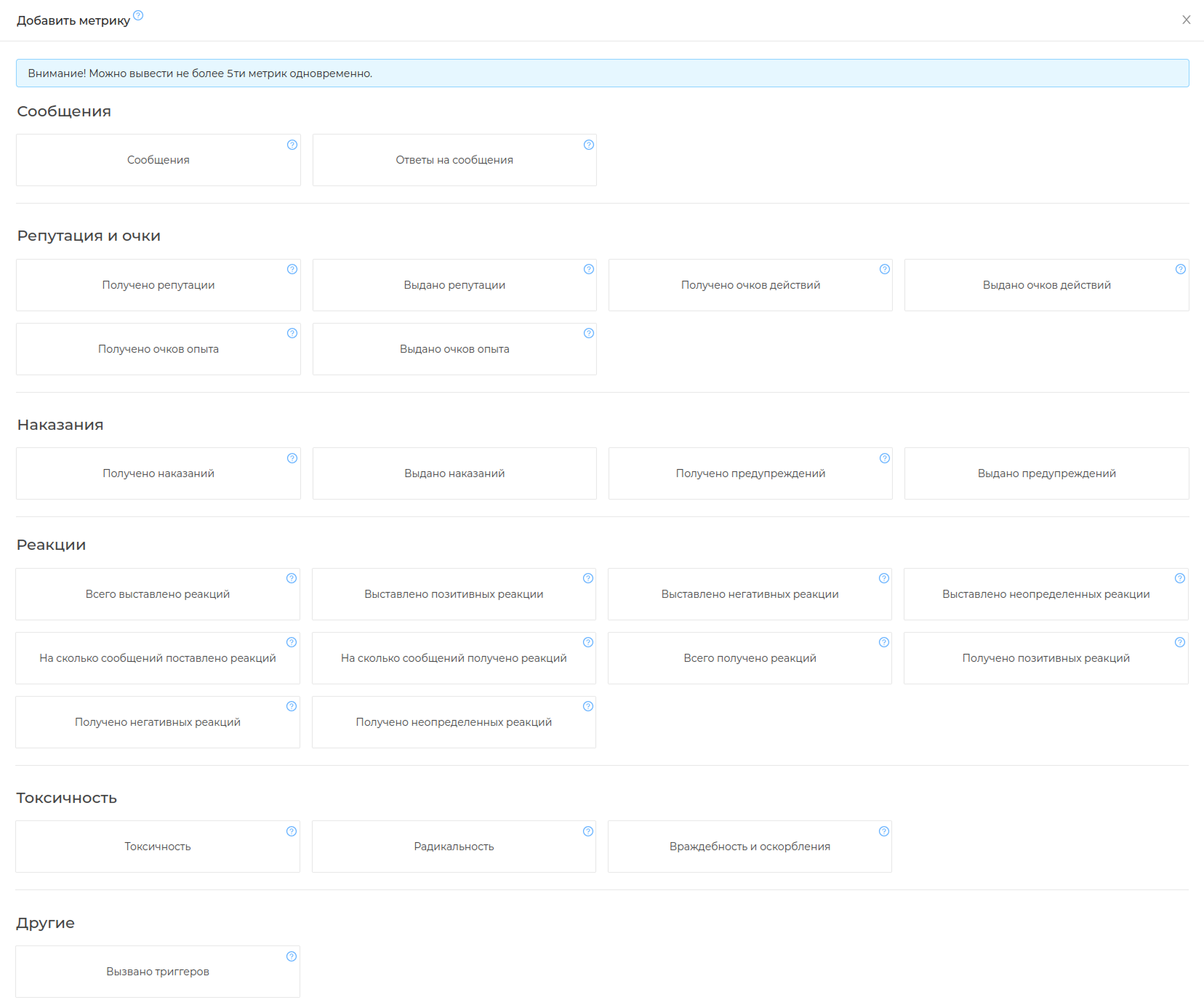
The data is presented as graphs and shows the metrics that are selected for analysis. You can select no more than 5 metrics at a time. By default, 3 main metrics are displayed: messages, replies to messages, received reputations.
There are a total of 26 metrics in the list. All metrics ** are categorized** and describe the types of data they collect.
Messages — shows data on the total number of messages and replays written in the chat and per individual user.
Reputation — shows data on the issued and received reputation points (opens new window), actions and experiences in the chat and per individual user.
Reactions — displays data on issued and received positive/negative and undefined reactions to chat messages and to an individual user. ❗️To receive data on this metric, the use of chat reactions** must be enabled in the group settings.
Toxicity is a unique metric based on AI. Chatkeeper is able to determine the level of negativity in a message using the filter of the same name (opens new window) and the conditions in the trigger. Data on the level of negativity in your chat is displayed using this metric.
Other — will show data on the number of triggered triggers (opens new window) in the chat and on an individual user.
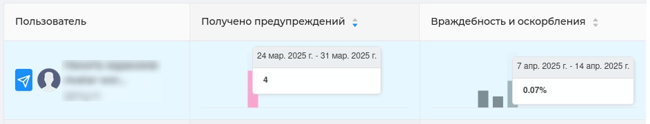
Example: we add the metrics "Warnings received" and "Hostility and insults" and see users who behaved inappropriately and received a warning for this.
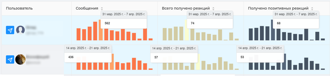
Example: adding the metrics "Messages, "Total reactions received," "Positive reactions received." This will show us the most sociable users and how other participants rate them. The posts of these users collect a lot of ratings and they are almost all positive.
# User profile
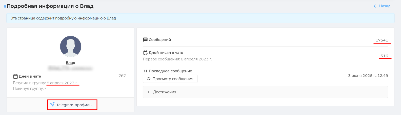
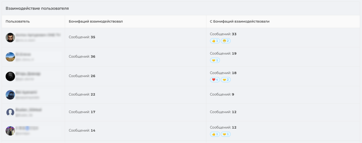
You can open each participant's card and get to the page with detailed information about him. The user's profile will show general information about him, information about messages, a table of interactions with participants and chat events related to this user.
General information includes: — name, username (if any), Id — date of entry and exit from the chat — the number of days in the chat — the number of messages written (including replies) — how many days the participant wrote in the chat (indicating the date of the first message) — achievements received (https://cabinet.chatkeeper.app/chat/CHAT_ID/achievements )
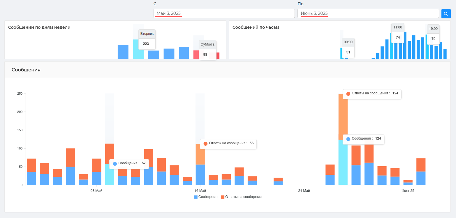
The following is a graph of the number of participant's messages by hour, day of the week, and day of. This will help determine the most active communication time of the participant.
Example: The graph shows that the participant communicates the most on Tuesday and is most involved in the conversation at 11.00 and 19.00.
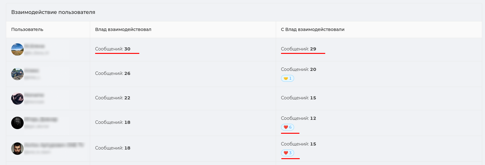
The table below shows the user's interaction with other chat participants. Namely, which participants did he communicate with the most during the specified period, how many reactions and messages did they send and send to each other.
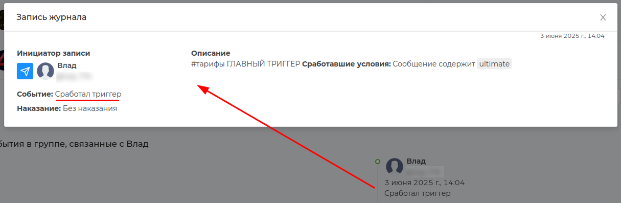
The last graph will show events in the group related to the user. This includes triggering the bot settings on this user and the user using the bot settings themselves (if they have the rights to do so).
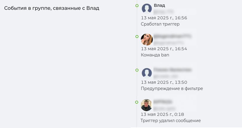
Example: a trigger has been triggered on the user
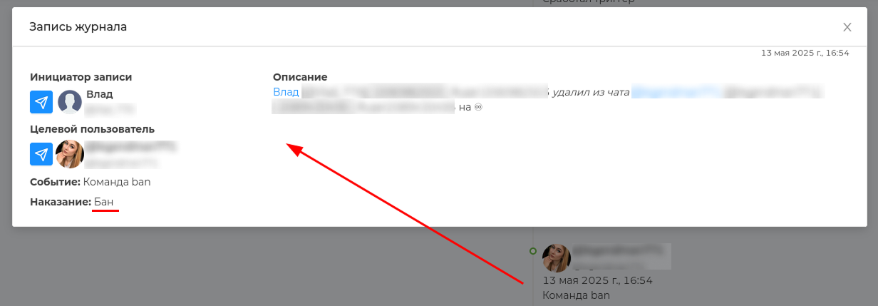
Example: a user (admin) applied the /ban command to another user and deleted him from the chat forever.
# Statistics on administrators
Special Schedule (opens new window), which will help you monitor the effectiveness of your chat admins. With it, you can easily determine who is shirking and who can ask for a bonus for recycling, and this is no joke!
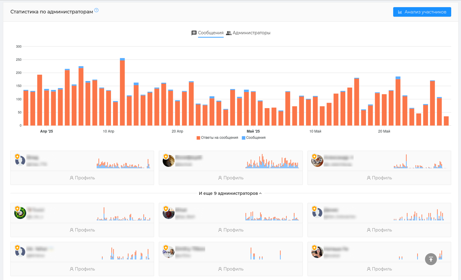
What is the use of the schedule: — it is easy to identify the most active and quiet days when the admins were responding in the chat — you can see how many admins communicated on a certain day — each admin's card has a schedule of his personal activity
Administrator statistics (opens new window) is displayed in 30 days.
For a more detailed analysis, you can go to the administrator profile.
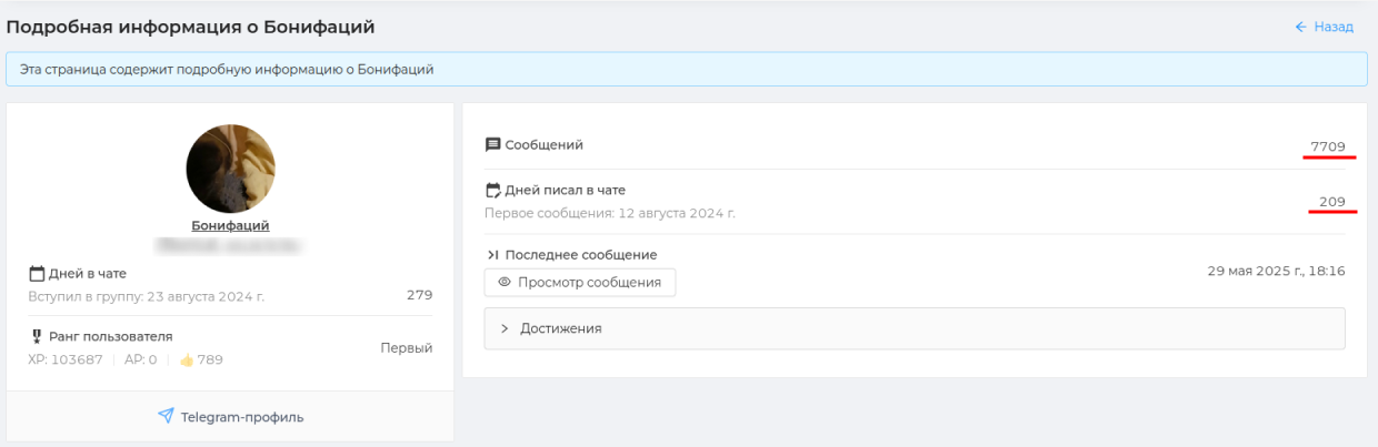
The profile will show general information about the admin (name, username, date of entry, etc.), the number of messages written ** by day of the week and hours **. This will help you determine the most active time of the administrator's work.
The ** admin's** interaction table with other chat participants will also be shown. Namely, which users he communicated with the most during the specified period, how many reactions and messages they sent to each other.
# Reaction statistics
Reactions to chat messages show the engagement of participants in communication, attitude to the author of the message, preferences and audience choice, as well as the mood indicator of your chat.
Reaction statistics (opens new window) in Chatkeeper takes into account this diversity of reaction values. Therefore, there are many metrics and you can deeply analyze your chat.
What is the use of the section: — it will show which emojis are used most often — identify the atmosphere of the chat and help manage it — shows participants who receive/give a lot of positive/negative ratings — shows the most active periods when a lot of reactions are given/received
Attention
Don't forget to enable emoji reactions in the group settings in Telegram. You can do this in the "Group Management" section in the "Reactions" section. The "All" or "Selected only" option is suitable.
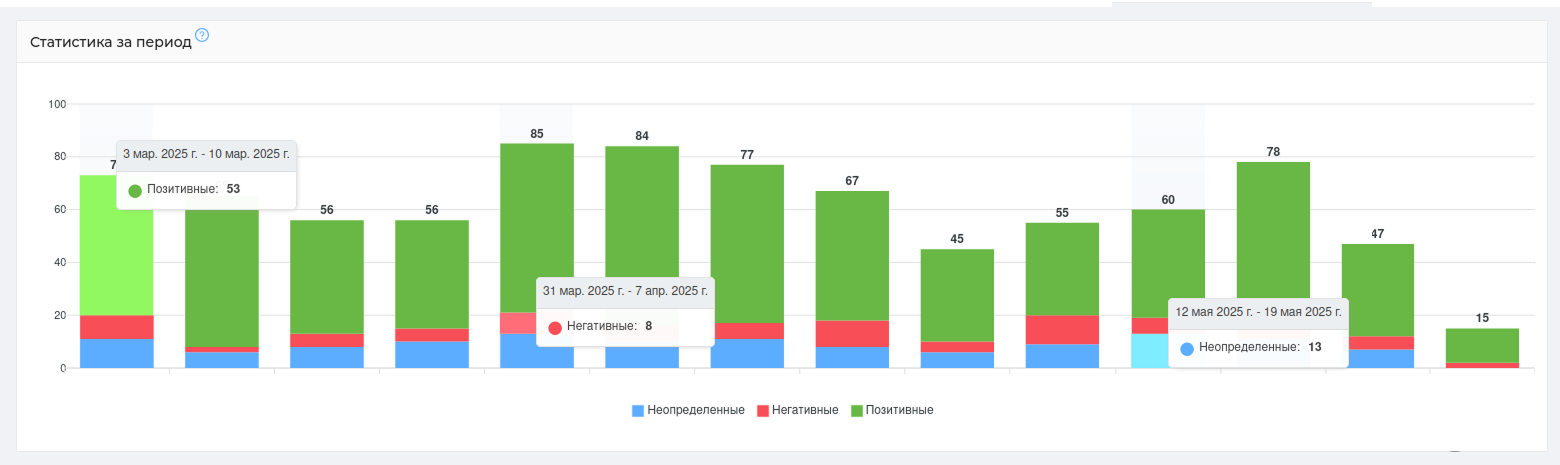
Reactions in ChatKeeper (opens new window) are divided into three categories: "positive", "negative" and "undefined". This division will quickly show the general mood of the chat and which reactions prevail in it.
The positive reactions of emojis include: 👍❤️🤝🔥🥰👏😁🎉🤩🙏👌🕊😍❤️🔥💯🤣🏆🍓💋😇🤗🆒💘🦄😘😎🎄
indefinite emoji reactions include: 🤔🤯🥴🐳🌚🌭⚡️🍌🤨😐🍾😈😴🤓👻👨💻👀🎃🙈✍️🫡🎅☃️💅🤪🗿🙉💊🙊👾"🤷♂️🤷🤷♀️
The negative reactions of emojis include: 👎😱🤬😢🤮💩🤡🥱💔🖕😭😨😡
If custom reactions are used in your chat, they will be shown in reaction statistics as their alternative values from the classic emoji reaction catalog.

Hint
The classification of reactions into "positive", "negative" and "uncertain" was invented by [ChatKeeper] (https://t.me/ChatKeeperBot ) and may not coincide with your individual interpretation of reactions. But we tried 😇
Reaction Statistics (opens new window) is displayed for a certain period. By default, ** data is displayed for a period of 3 months**, but you can select the period you need. The data can also be grouped by days, weeks, months, and years. By default, grouping by week is selected.
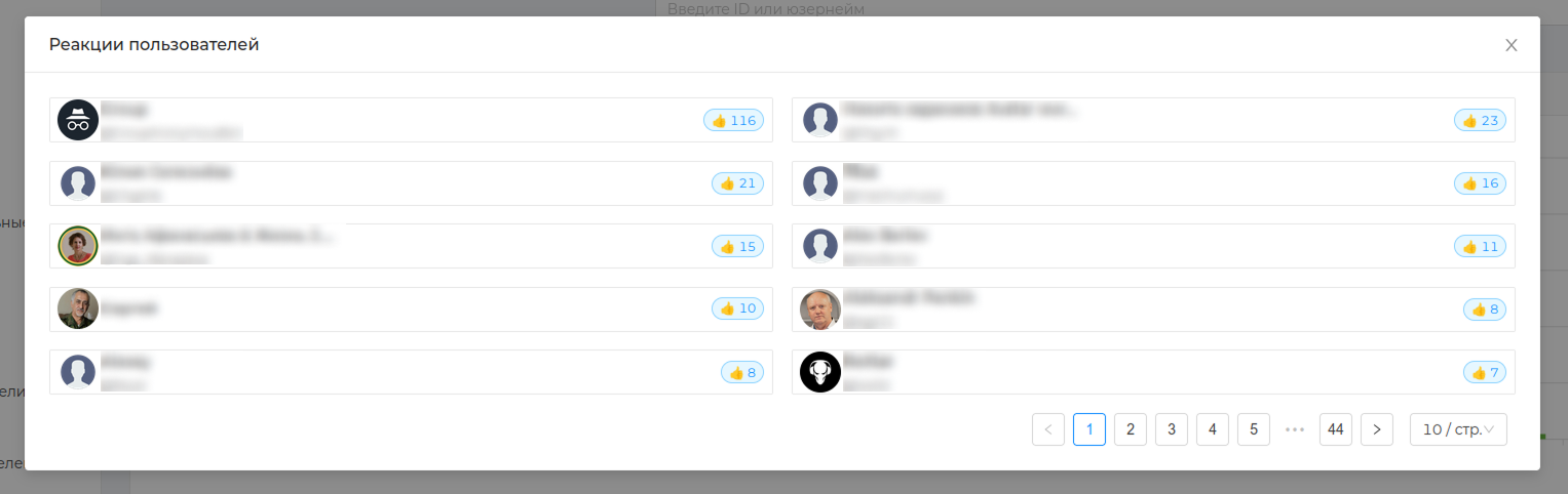
You can view the data on the issued and received reactions ** in the chat and on an individual user**. Usually, those who receive and give reactions are 2 different audiences. Now you can analyze both audiences.
Example: The graph shows that positive reactions prevail in the chat - users give them out in large numbers, which indicates high engagement. The choice of these reactions shows a positive atmosphere in the chat. Reaction 🤝 — indicates mutual assistance in the chat.
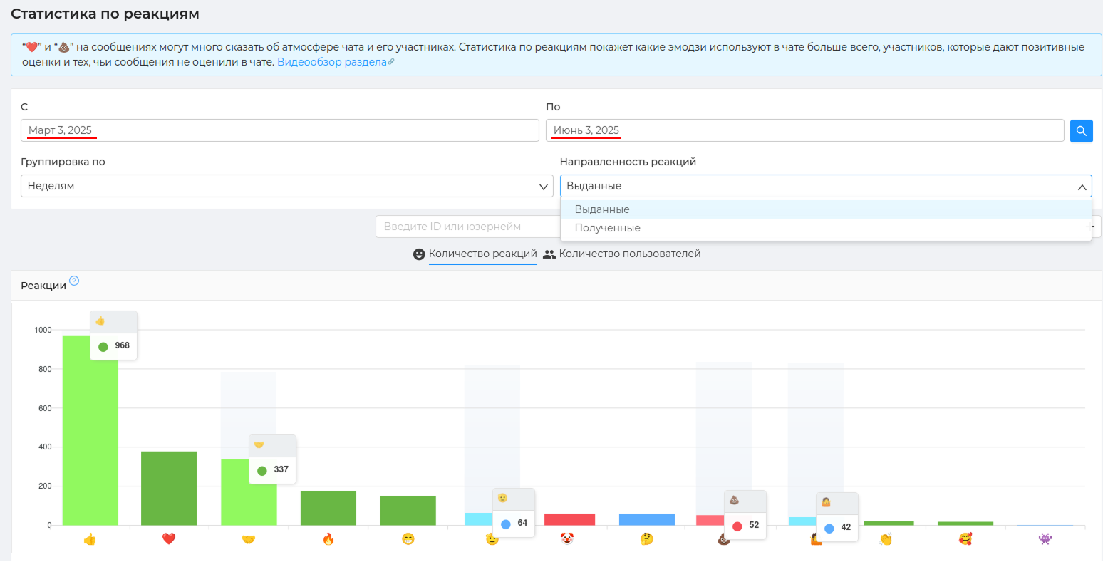
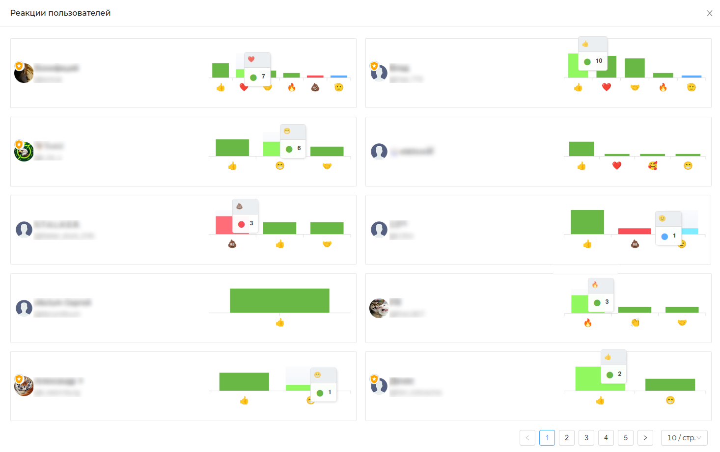
Each individual column will show the users who rate/receive the selected reaction and its number.
The graph below shows the total number of reactions per week (depending on the grouping) compared to other weeks, as well as the ratio of positive, negative, and undefined reactions.
You can determine the most active periods by the number of reactions, as well as periods when there were many reactions of a certain type.
Each individual column will show who these users are, who posted reactions during the selected period, as well as a list and number of their reactions.
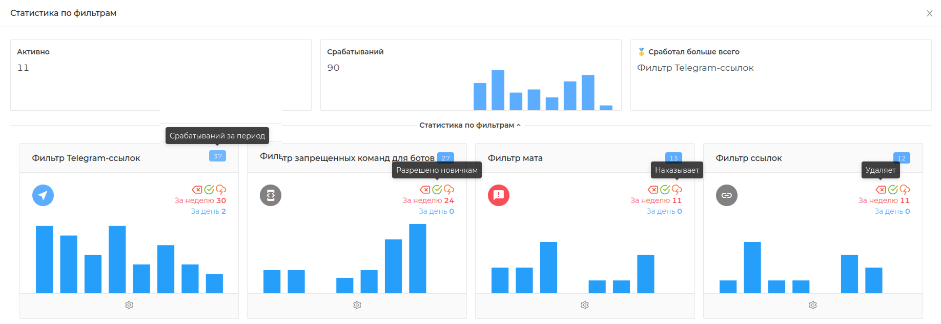
On the [Dashboard] page(https://cabinet.chatkeeper.app/chat/CHAT_ID) at the very bottom you will find graphs that will help you monitor the statistics of the bot settings in your chat.
The bot will record the performance statistics of the Filters — Triggers — Reputation systems — Manual moderation
Example: the graph shows that 11 filters are currently active in the chat, they have worked 90 times during the period, most often [Telegram link filter] is triggered (https://cabinet.chatkeeper.app/chat/CHAT_ID/module/SelfLinksFilterHandlerModule )
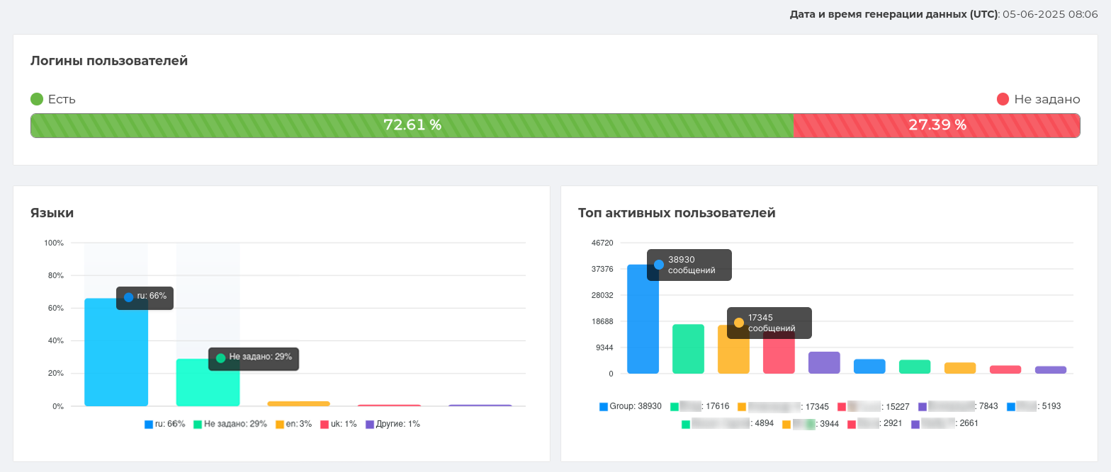
# Users
Statistics on chat users. Data on languages, logins, percentage of flooding, and number of chat messages
By clicking on the arrow on the left, you can see the user ID, a link to the member's profile, a small activity graph. Clicking on the "More information" button opens the schedule of activity of this participant by the hour (number of messages, their length, flood).
In the screenshot, users are arranged "as they are." In order to arrange the list by name/number of messages, ... and so on, click on the corresponding table label. You can view users in both descending and ascending order.
# Referrals
Referral - the user who brought new members to the chat. For your convenience, we have created statistics that keep track of such users. In it you can find out how many and which user brought new members.
This is how referrals statistics look like.
In the screenshot, users are arranged "as they are." In order to arrange the list by name/number of referrals/login, click on the corresponding table inscription. You can view users in both descending and ascending order.